Just when you think SharePoint can’t get any sexier…. Boom!!! Meet the SharePoint Look Book. Mentioned by Jeff Teper in his keynote, I immediately made a note, and then had a look as soon as I could. And I’m impressed, super impressed.
Not everyone considers themselves creative, so it might be difficult to find some inspiration when you’re planning your sites and page layouts. The SharePoint Look Book supplies us with examples of different page layouts in modern SharePoint for different scenarios / use cases.
Where can you find the Look Book? Simply go to https://sharepointlookbook.azurewebsites.net/. It’s also available for download.
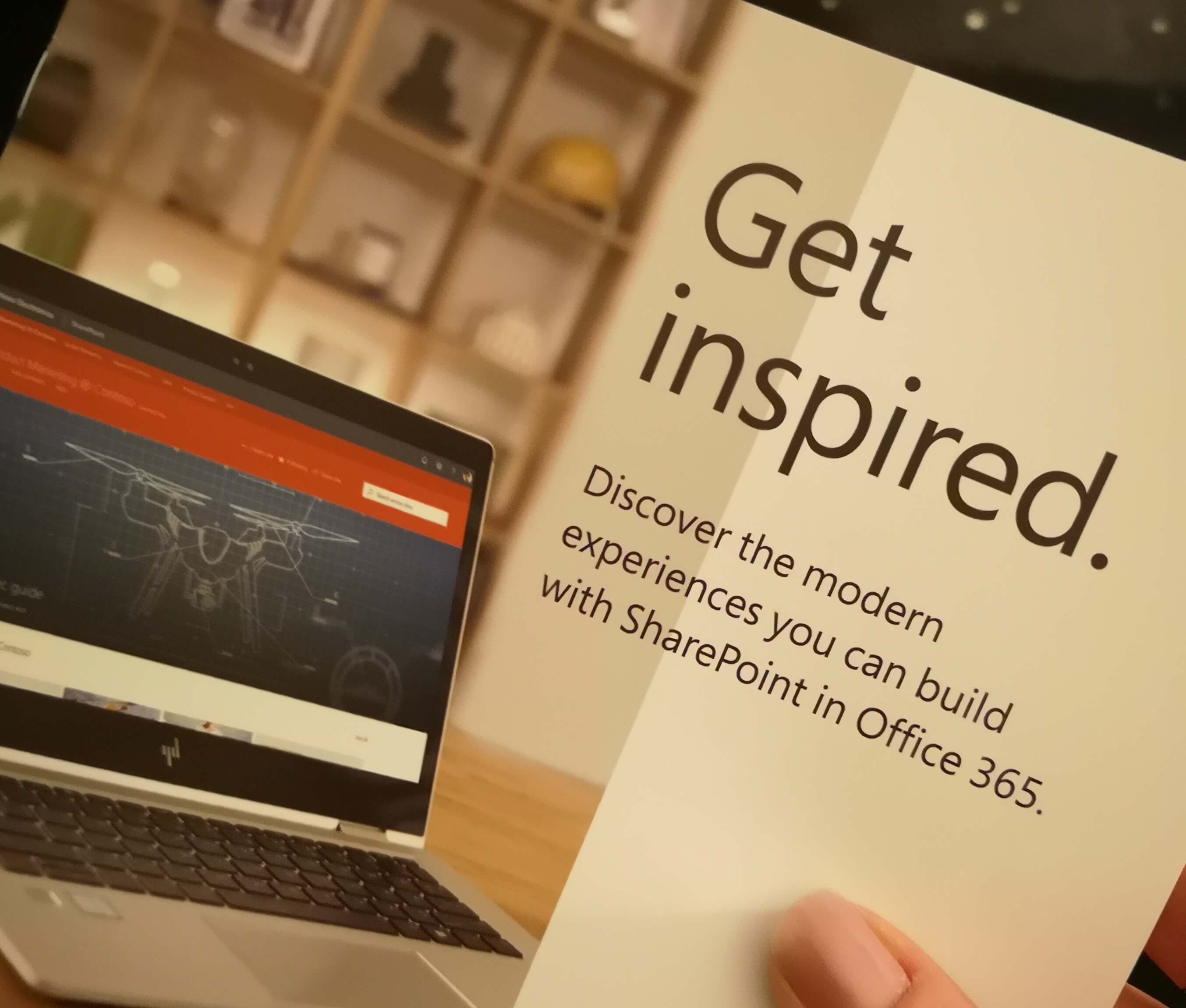
“Get inspired. Discover the modern experiences you can build with SharePoint in Office 365”
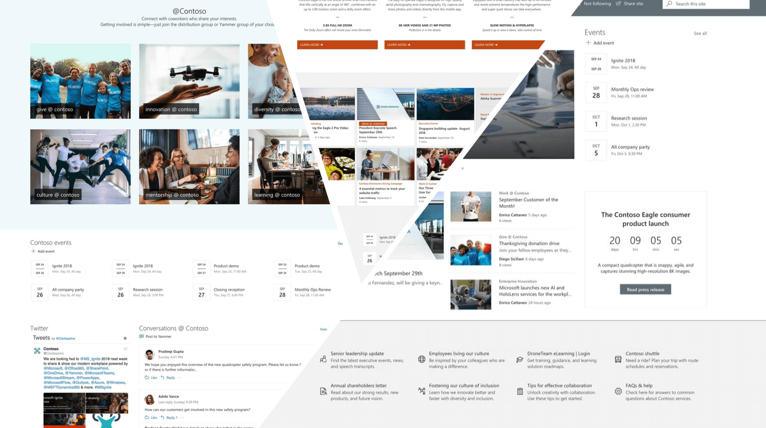
If you’re at the #ESPC18 Conference, head over to the Microsoft Stand in the Expo Hall and grab a printed copy of this pocket size booklet, brimming with inspiration. And while you’re there, have a look at the Surface Go (which is what I’m typing this blog on). I absolutely love my GO, it’s my travel companion for conferences and I also deliver training on it every day. The fact that it’s small and powerful is a bonus as I carry a backpack on my motorcycle which I ride to work every day. The Microsoft Go + Office 365 brings the “Every person, any place, any device, any time, anything I want to do” – vision into full circle for me. That’s real empowerment.
Now as mentioned, on the SharePoint Look Book site, you’ll find many examples, sure to get you going. You’ll be creating beautiful, responsive SharePoint sites, in no time.
Intranet
|
Hub Sites
|
Communication Sites
|
Team Sites
|
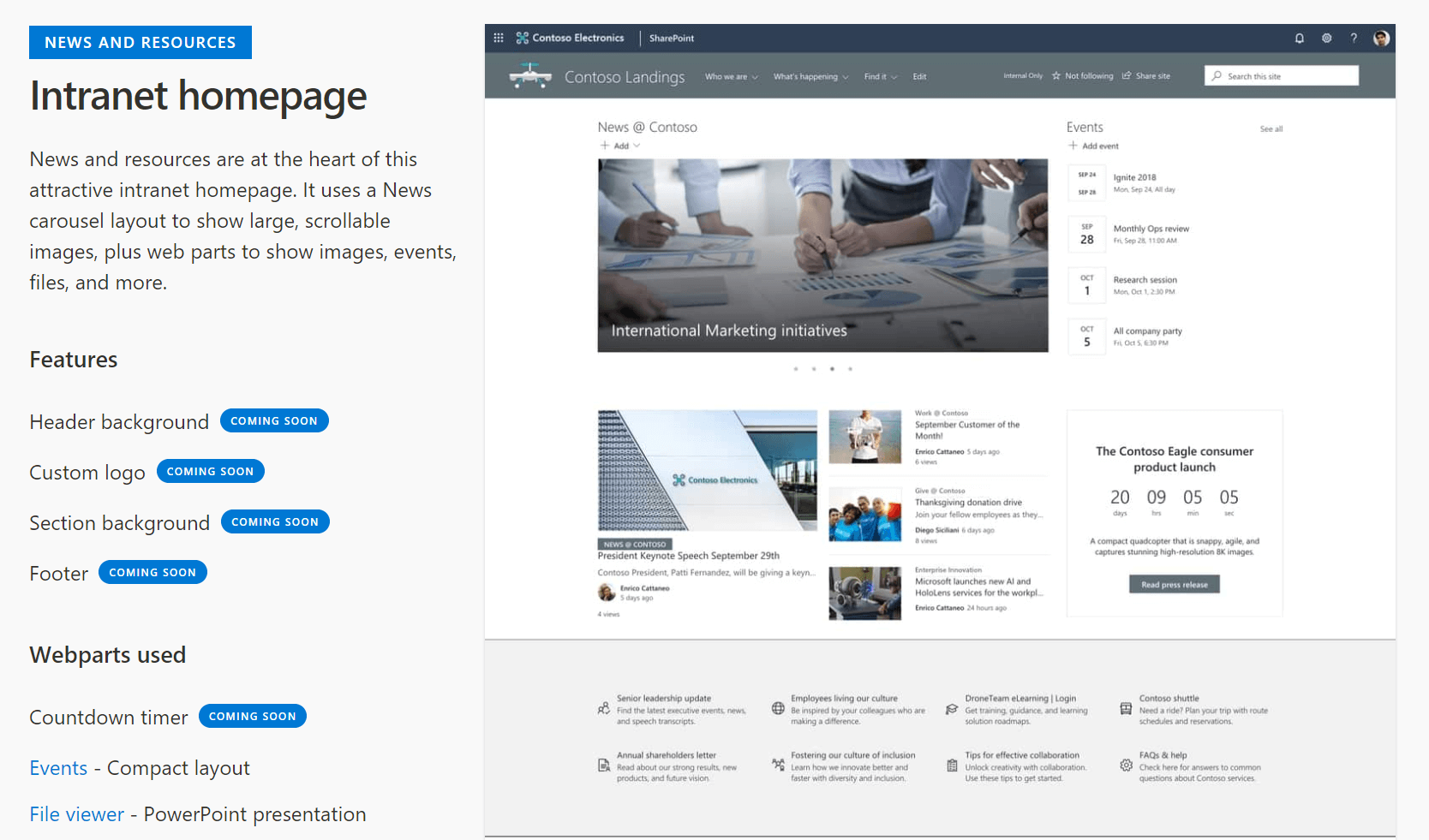
Below you’ll see notes on the left, where it mentions features that might not be available yet, and which webparts were used. When you click on the webpart link, it takes you to the support.office.com article on how to use that webpart.
Thank you, Microsoft, for not only exceeding my expectations, but supplying us with the tools and resources, to be better than we were yesterday.
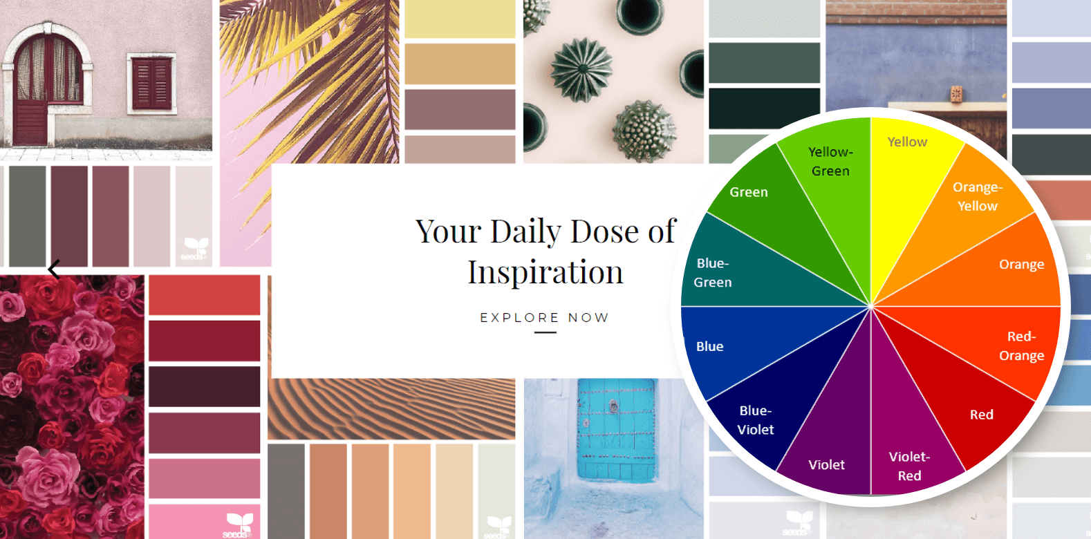
To wrap up I’ll give you a design tip, there’s a site that I follow called Design Seeds (for all who love color). They use beautiful photos and then display the colors presented in the photo. I use Design Seeds when I need some inspiration for colors to put together in PowerPoint presentations, Sway and SharePoint Pages. You’ll see that I’ve added the color wheel to the Design Seeds image. Want to know the most complimentary color you can add to your SharePoint site? Simply use the color opposite the color on the color wheel. For example: Red / Orange compliments Blue / Green colors best.
With all the tools available, I’ve run out of excuses for not being creative. I hope you have fun with the SharePoint Look Book and if you’re not at the conference, I’ll be sure to see you next time.
