A SPFx table of contents for your SharePoint modern pages to direct the readers where they need to be, in addition to making your pages more reader-friendly.
On your SharePoint pages, using a table of contents can be useful to direct the reader to exactly where they need to be, in addition to making your SharePoint pages more reader-friendly.
Currently, no Out-The-Box WebPart or feature exists to generate a Table Of Contents based on the content of the page. It was already the case for the legacy pages (classic experience) of SharePoint. That is why I created a little script for the classic experience of SharePoint that you can find in my other post: Create a dynamic Table of Content for your SharePoint Wiki pages
Because this little script seems to meet your expectation, I think a Table Of Contents for your SharePoint modern pages can be useful too
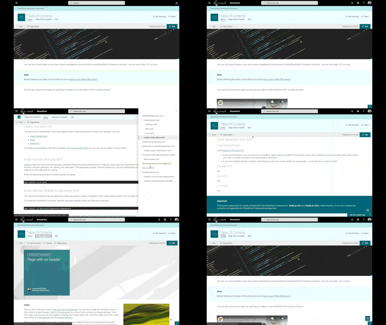
Below is a preview of the SharePoint Framework extension from SharePoint Online:
What are the current supported features:
- ApplicationCustomizer
- Can be deployed into the whole Tenant
- Add a button at the bottom of all pages of the site collection (if at least one header exists into the current page)
- When clicking on this button, a right panel will open with all clickable headers
- Change button shape
- Change button icon
- Specify supported headers
- Support headers from H2 to H4
How to install this SPFx Table Of Contents extension
If you want to install this extension for all site collections of your Tenant, the easiest way is to deploy it into your Tenant App Catalog directly.
You can just add the extension with a drag & drop of the package .sppkg into the Apps for SharePoint library or by clicking on Upload.
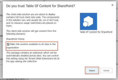
Once done, a modal will appear to deploy the package. If you want to deploy and enable the extension for all sites collections in your Tenant, check the case “Make this solution available to all sites in the organization” and click Deploy
Once deployed for all sites, you can go on whatever sites collection with a page with at least one header and you should see something like this:

If the default configuration is not what you want, you can change:
- The shape (
squareorcircle) - The UI Fabric icon
- The supported headers (between H2 and H4)
Note: the button uses the primary color of the site theme
If you wish to edit the configuration, you have to go to the “Tenant Wide Extensions” list located into your Tenant Apps Catalog (only available on the Tenant Apps Catalog)
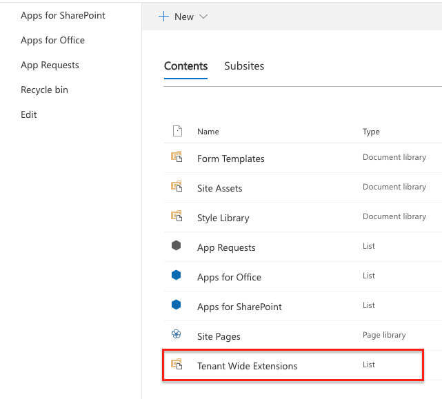
Component Id that equals ec4bf35f-7f65-49e7-8b28-c9a59d2d712a:
Edit the Component Properties of the item like this (for example):
{"tocIcon":"AnchorLock","tocShape":"circle","tocHeaders":""}
CopyExample of custom configuration
Save the item and go on whatever sites collection and you should see something like this:

![]() Explore the solution on GitLab
Explore the solution on GitLab
Web Part alternatives
If you prefer to use a table of contents as Web Part, some contributors of PnP have already develop two alternatives:
- A Web Part component that you can put into your page content (into the vertical section for example): https://github.com/SharePoint/sp-dev-fx-webparts/tree/master/samples/react-page-sections-navigation
- A solution based on two Web Parts that allows to stick some anchors to the top of the page content: https://github.com/SharePoint/sp-dev-fx-webparts/tree/master/samples/react-page-sections-navigation
Hoping this post will help you
About the Author:
Microsoft 365 Architect / Consultant – Learning and sharing about my interests. SharePoint, Microsoft365, Modern Workplace
Reference:
Sittler, L. (2020). A SPFx Table Of Contents Extension for SharePoint. Available at: https://blog.lsonline.fr/2020/05/13/a-spfx-table-of-contents-extension-for-sharepoint/ [Accessed: 11th September 2020].


