Adding design to your SharePoint sites will drive engagement
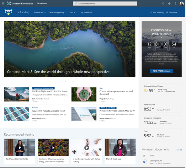
You would never think about having an external website without design, your internal SharePoint should be no different.
Employee engagement is the cornerstone of any successful business. Yet, 30% of internal comms, HR, and senior leaders see it as a continuing challenge in 2024.
Designed correctly – with your employees needs at its core – your SharePoint intranet should be a first port of call when logging on at the start of the working day.
A personalised home screen with portals, resources, news, events – and so much more – will give your people the confidence that they are ‘plugged in’ to what’s going on, regardless of where and when they’re working.
When building your SharePoint intranet, you can add lists, libraries, and hundreds of other apps to give your employees instant access to all the tools and information they need to stay connected and productive wherever they are working.
1. Use Images for a visual experience
Images can really enhance the user experience by guiding people to the content their looking for, or the task they are completing. Bold headlines will allow users to scan and skim your page faster. Facilitating an easy journey to the information they need will negate frustration and drive engagement.
We often find that authors complain about images in SharePoint, but SharePoint Modern has a great Image Editor which has been further enhanced in 2023 with greater editing capabilities including cropping to common aspect ratios and adding text overlay.
Images are typically owned and maintained as part of an organisations brand. We recommend adding the Organisational Assets Library to the picker which gives authors access to a library of photos, logos, and icons. This sits right next to the Stock images and Web search in the image picker.
2. Plan to use horizontal space
There is no left navigation bar on SharePoint Communication Sites, providing more horizontal space to work with than older SharePoint versions.
This offers three column layouts and using multiple news parts on a News landing page facilitates clearly displaying categories of news, aiding quick navigation.
3. Use Different Link Styles
Quick Links are an excellent feature and used effectively create an easy-to-read library of information at one click. It is common to use it multiple times on the same page.
There are several ways to display your quick links.
• Apps ‘pinned’ to a page in a button format with icons and descriptions
• Images added to a grid create a great visual experience
• A grid view of links with icons
• A simple list of related documents with small icons to indicate the link type
4. Add sections to break up pages
Sections are an excellent feature that were not available in classic SharePoint. You can use sections to break up pages by columns and colour.
There are two special sections that can only be added independently of each other: Full-width section and Vertical section. In other words, the full width section can be added to a page that isn’t using a Vertical section and vice versa.
A 2023 update includes section templates which are now available when creating pages and news content. Section templates give a quick start to creating content using sections, with pre-defined layouts. Use them in different combinations to create your own section layouts.
5. Go further with collapsible sections
Another enhancement to Sections is the ability to expand/collapse sections.
This is an effective way to break up a page that has detailed content such as tables or historical material. Hiding this information allows the user to drop down only relevant information they require.
Use the power of SharePoint
SharePoint pages have been developed to be more easily edited empowering authors to create appealing visual pages, enticing landing pages that link to other areas, or display data rich content in an easy to read and scan format.
Modern pages have really moved forward and been improved from previous SharePoint versions, and so now is the time to get rid of PDFs and move that content to pages instead.
About the Author:

Mark Bowerman
With over 35 years of experience in the field of graphic design and visual communications, I am a seasoned and passionate professional who leads creative solutions for engaging and effective communications. I have a proven track record of delivering high-quality and innovative projects for a diverse range of clients, from corporate to cultural, across various media platforms and channels.
As the Managing Director of Upriver Creative Limited, a new and dynamic agency that I co-founded in August 2023, I oversee the strategic direction, business development, and client relations of the company. I also collaborate with a talented and multidisciplinary team of designers, developers, and consultants to provide bespoke and integrated services in branding, identity, web design, digital media, and employee engagement. My mission is to help clients communicate their vision, values, and goals effectively and authentically, and to create memorable and meaningful experiences for their audiences.
Reference:
Bowerman, M (2024). SharePoint – Designing for Engagement. Available at: SharePoint – Designing for Engagement (uprivercreative.co.uk) [Accessed: 26th September 2024].

