When we think of a SharePoint site page, we want it to be not only beautifully designed, but also functional. The footer of the page is one of the essential, strategic components that can be both helpful and nice-looking.
So first of all, before going into designs, let’s think about the functional features.
We at ShortPoint believe that the perfect footer has to be…
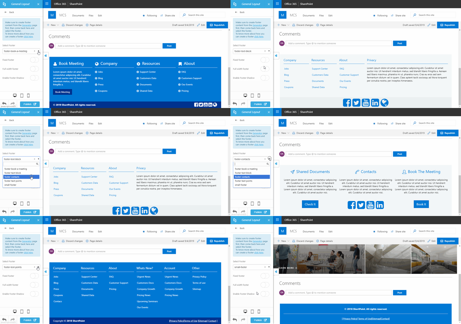
… easily manageable
Choose from a variety of designs presented at our Demos Website or create your own. Using ShortPoint, you are able to manage each footer easily and apply it to your sites effortlessly:
… quick to replicate or move
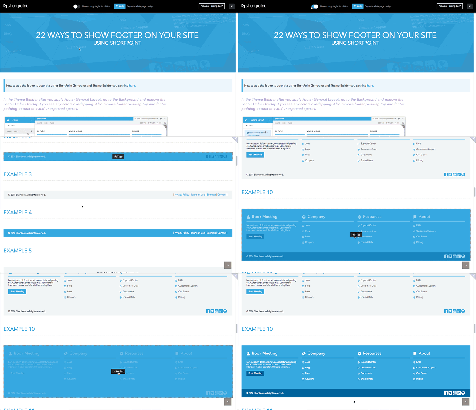
With our magic Copy & Paste feature, copy any footer from our Demos Website and put it right into your SharePoint site. You will also be able to copy and paste footers and all other ShortPoint elements inside your environment. Saves a lot of time and effort! And of course, you will be able to customize everything.
Copying any design is super easy, just like in the animation below. To learn in detail about every step of the process, please check out our full animated tutorial.
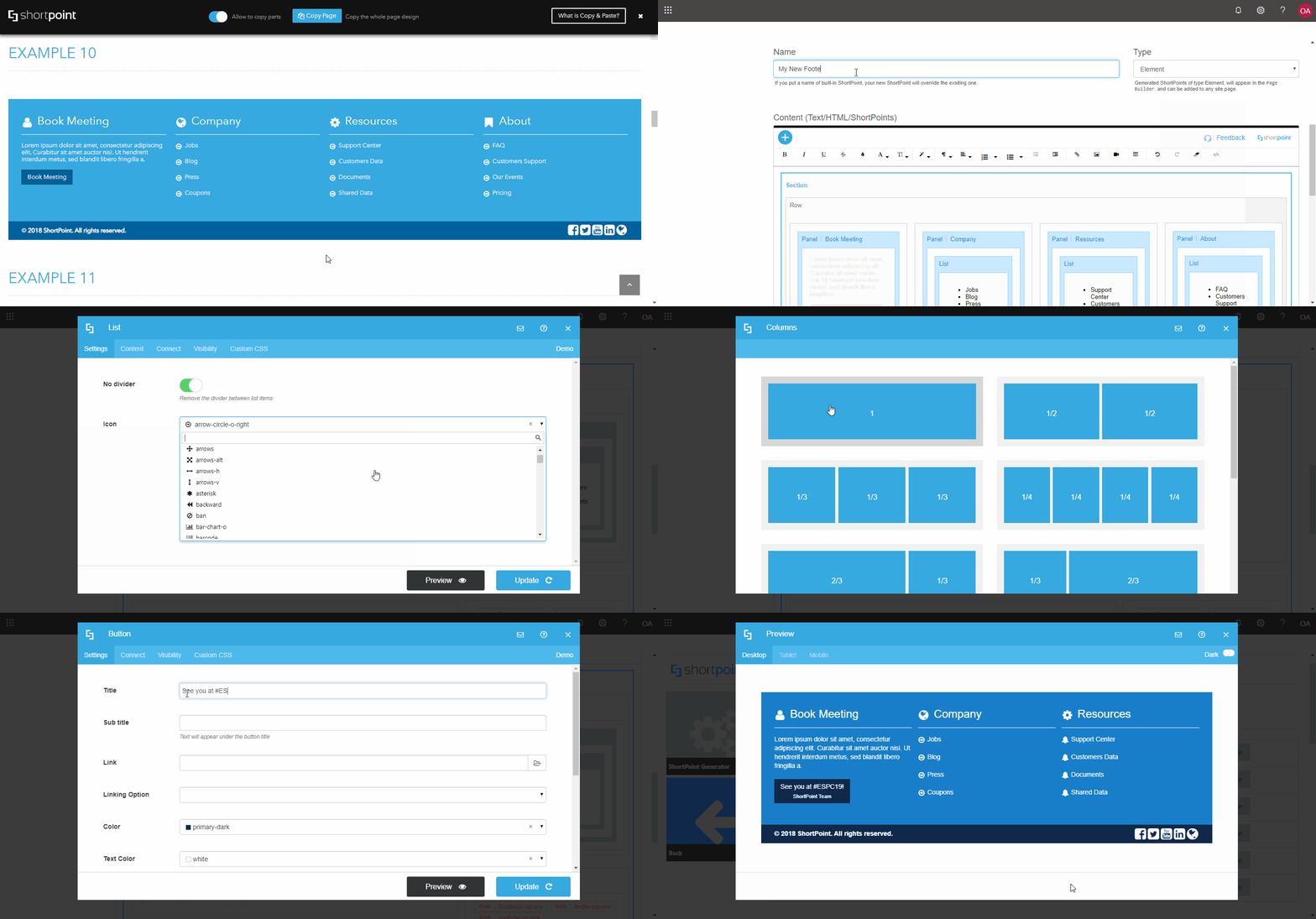
… easy to build, modify, update
Powered by the powerful and versatile ShortPoint Page Builder, the process of creating a footer is intuitive, easy and quick. Does not require any tech or coding knowledge and gives you lots of design possibilities.
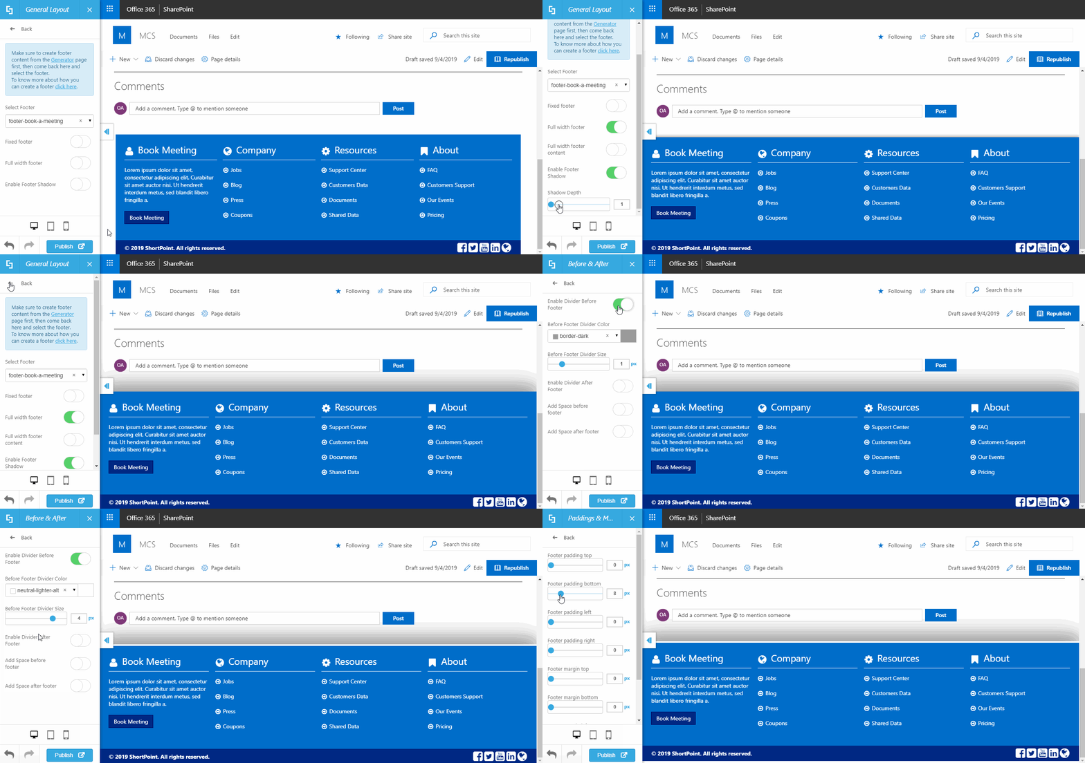
… customizable
Make your footer unique with a selection of tools to adjust width, height, paddings, margins, backround colors and overlays, dividers and a lot more. Using ShortPoint Theme Builder to customiza the footer is intuitive and easy.
With all of these in mind, we would like to present you with 10 footer ideas that you can use in your SharePoint 2013, 2016, 2019 or Online environment.
Option 1: Minimalist
Bring in an elegant and concise finish to your page with a simple, one-line footer like in the example below. Include a copyright and links to your most important documents.

Tip: Make sure all the information you include into your footer is what you want to see in all site pages. You don’t want to include anything specific for the given page, because the footer will be the same on all pages of the site. Therefore, it’s perfect to go with the basic things: contact information, sitemap, terms of use, EULA, SLA, roadmap etc.
Option 2: Social Minimalist
Nowadays, so many important things happen in the social media. If you want to promote your social media pages among the users and invite them to a more informal online communication, use the example below to concisely connect users with Facebook, LinkedIn, YouTube, Twitter or any other platform of your choice.

Tip: One of the awesome things about creating a footer using ShortPoint is that the icons are there. You don’t need to upload any info graphics such as YouTube or Facebook icons: just choose from hundreds available in the product!
Option 3: Categorized
When you need your users to have lots of links at hand, this is a great way to go. The below example was created as an alternative to a full-fledged site navigation that can be also presented in a header, or mega menu. This footer also features a column with all the social media links, as well as the bottom row containing copyright, policies, terms of use etc.

Tip: If you don’t want to build the footer yourself, please visit our Demos Website to copy a footer of your choice from there and paste to your site. And yes, you will be able to customize everything.
Option 4: Warning Text
Combine the above described functionality with a text paragraph. Inform the site users about something important with a text block: let’s say, new privacy regulations, site off for maintenance warning, etc.

Tip: In ShortPoint, you can choose any color scheme for your footer that you can possibly imagine. Here is the same footer in blue (we’re just sticking to a limited color scheme for the purpose of keeping this article visually balanced).

Option 5: Countdown
Use a lovely countdown in the Footer if your organization members or site visitors just can’t wait for something to happen.

Tip: ShortPoint Countdown element will soon allow you to count up, not only down. Please keep up with our latest product releases to enjoy the feature soon. Watch a video about the renovated Countdown in our Knowledge Base.
Option 6: Interactive

Another color option of the same design:

Tip: use Lightbox linking option for buttons to open a link in a box on top of the existing page and not get the user redirected to another browser tab. Here is an example:

Option 7: Multi-leveled
Again, this one is useful for organizing a big, categorized site navigation inside the footer. Allows to achieve a more formal look.
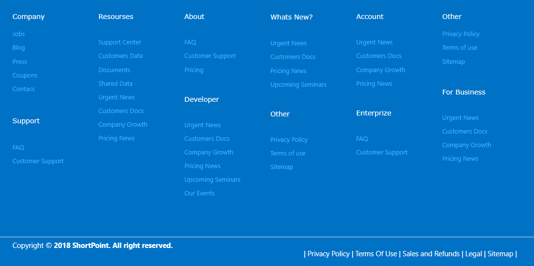
Tip: ShortPoint footers can be applied both on Classic and Modern SharePoint Pages. Enhance your Modern SharePoint experience for both Team and Communication sites with our SPFx-enabled Theme Builder.
Option 8: Detailed
Works very well especially for public accessed websites storing lots of pages and information.
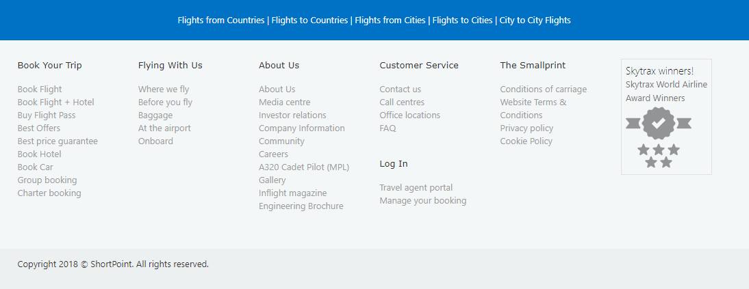
Tip: you can insert images, icons and logos into the footer, like the award badge used in the footer above. You can make those clickable, too.
Option 9: Split in Columns
Order information nicely in two, three, four or more columns. Like this:

Tip: copy and paste footers! Visit our demo site footers library for a wide selection of the most functional designs if you don’t like to spend too much time creating your own.
Option 10: Geographic
Include a map into your footer to point users to a direction. Users will be able to use the map live: zoom in and out, switch into Satellite mode and take advantage of the familiar Google Maps functionality.
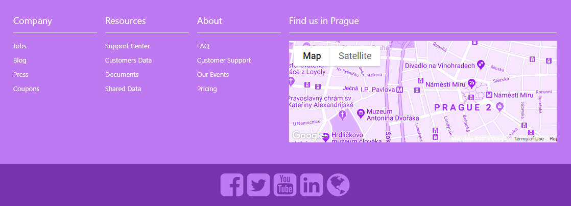
Tip: learn more about the map element in our Demos Website.
Option 11: Sliding Text
Create an eye-catching footer by incorporating an animated text show. Users can click the arrows to turn the slides themselves, but you can as well set the text show to slide automatically in custom time intervals.

Tip: Incorporate as many slides as you need. As with all ShortPoint elements, you can combine whatever you like from any of the examples and create your own awesome footer.
We hope this blog post has inspired your creativity!
If you want to learn more about our product, ShortPoint, you’re welcome to register for our regular free webinars.
Have a great time ahead and see you soon at the #ESPC19!
Reference:
ShortPoint (2019). Available at: https://www.shortpoint.com/11-footer-designs-for-sharepoint-modern-pages/ [Accessed: 23rd September 2019].





 Using a SharePoint Online list as a Knowledge source via ACTIONS in Copilot AI Studio
