News are an essential part of any Intranet site. And this is not surprising, since SharePoint sites are created predominantly for sharing information, announcing events and making sure everyone stays on the same page regarding whatever they work with.
In this article, we at ShortPoint would like to suggest you 10 ways of presenting news in your SharePoint Intranet to make them stand out.
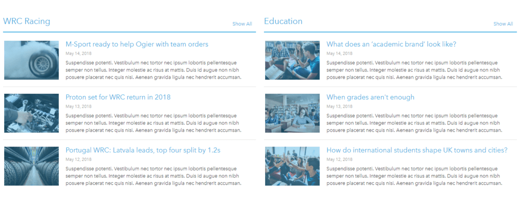
Option 1: Thumbnails
The easiest and most classic way to present news. Works especially good for blog posts and short articles. Gives the user a quick glimpse of the topic before they can click to read the full piece.
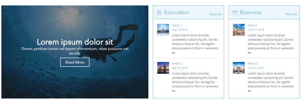
Option 2: Regular + Highlighted
Bring the most important topics to attention using a slideshow on the right, while the rest of the news are categorized into two topical panels on the left. Using vibrant images for the slideshow makes sure the users won’t miss the most important news.

Or, switch left to right and apply a different style, for example this one:
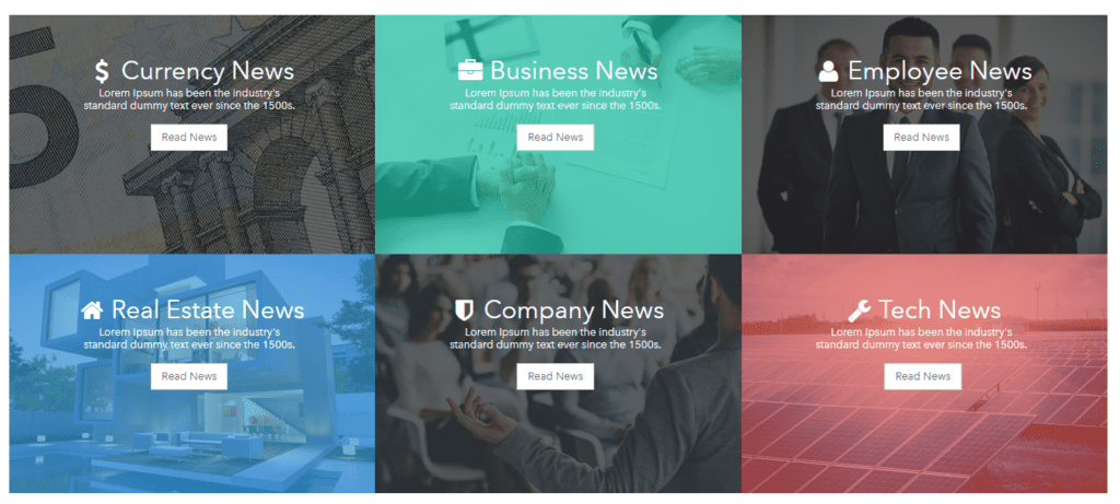
Option 3: Image Tiles
This customization of news will bring bright colors to your website while not overloading the user with excessive information. This style is a concise yet attractive way to keep others updated on what you want to highlight most.
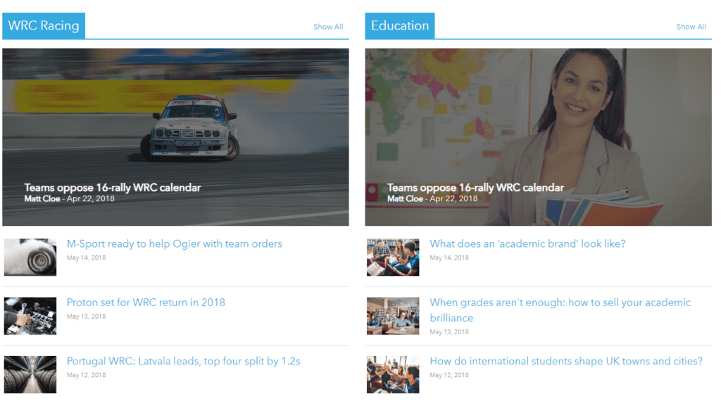
Option 4: Highlights and thumbnails
Works well with literally anything: just don’t forget about the pictures. The panels on the top offer you a simple way to categorize topics.
Option 5: Ticker
For fans of exchange markets and indexes: present your news so they resemble a stock ticker. Takes minimum of space on the page, redirects user to the full page after clicking and works well if you’re out of images:)

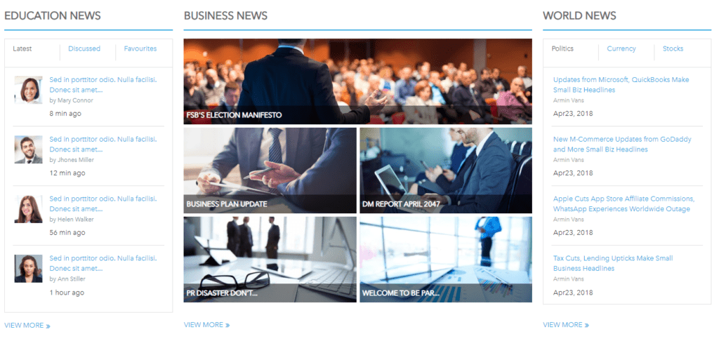
Option 6: Rich and Ordered
This style makes your life simpler when news pile up. If you have a lot to tell, categorize the news into two tab elements on both sides and present the essentials in the center.
Option 7: Eventful

Option 8: Text Carousel
Present textual news in a minimalistic manner using this style. Add as many items as you want and slide them all in a carousel. Works both automatically, in a time interval, and by click.

Option 9: Social
Present your news along with some statuses from your favorite social media. Highlight your preferred social page and show the news from your Twitter, LinkedIn or Facebook feed.

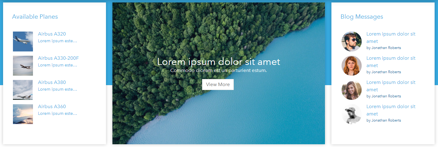
Option 10: Symmetrical
Use a stunning picture in the middle to present a news highlight, an introduction or an inspirational quote. Symmetrically situate two news panels from both sides. Use square thumbnails like on the left, or bring in a bit more elegance with round ones like on the right.
All of the above styles were created using ShortPoint. You are welcome to check our Demo Website with more ideas for SharePoint intranet pages.
See you at ESPC19!
Reference:
ShortPoint. (2019). 10 Ways to Present News in a SharePoint Site. Available at: https://www.shortpoint.com/10-ways-to-present-news-in-a-sharepoint-site/ [Accessed 31st July 2019].


